Ι TOPIC SOURCE
2017 UX Internship,
Vamonde.com
Proboscis Inc.
Ι ADVISOR
Junyoung Yang, CTO
Ι TEAMMATES
Individual Project
Ι PROJECT LENGTH
4-month Project
DESIGN BRIEF
—
About the Company
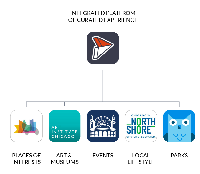
VAMONDE is a rising tourism platform which aims to lead the transformation to keep our most important cities and cultural institutions relevant in today's digital world.
Users create, publish, and measure their narratives here across a network. It empowers organizations to simplify their engagement process and grow visitor intimacy.
After several iterations with our to-C product, VAMONDE is taking steady steps to our next mission, which is to engage business customers. Tourism bureaus, cultural institutions and travel writers/bloggers are our main targets. So the task for me is to build a brand new content creation tool that our business customers would love to use.
About the Project
My job is to be the sole designer in a team of CTO, PM, Dev, and Marketing in a startup environment. I'm responsible for the redesign of a B2B module as part of the main website.
PROBLEM REFRAME - GET CLEAR OF THE TASK
—
What is a creation tool for?

Vamonde Creation Tool is a digital storytelling medium of writer's thoughts and reader's interest.
The necessity for the new creation tool - Learnings from Current Solutions
There are some obvious patterns among current tools: mobile based tool for creating simple content, or web based tool for creating complex content. This is caused by characteristics of each platform.
For Vamonde at this typical time to engage more business customers, we are shifting from mobile based to web based in order to better support our content.

Task Overview
TASK
FROM PRODUCT MANAGER
Design and help implement a new Creation Tool
DESIGN GUIDELINE
FROM RESEARCHER
Research Report and Design Proposals
- Provide the function of preview and give users better anticipation on the
outcome.
- Lower the learning cost
- Comply to current Vamonde VI
- Provide users more freedom to create.
LIMITS
FROM CTO
Must comply with the current content structure and brand identity.
In need of an actionable Design Goal
Everybody told me to build "a better creation tool". However "better" means nothing for a UX Designer. So I started to ask lots of whys to discover the underneath information of "better".
For Researcher, "better" means to fix dissatisfied moments and fulfil users'
expectations;
For PM, "better" means a tool that helps generate better content
For Marketing, "better" means a product that is up-to-date with the latest design
For CTO, "better" means an experience that can easily lead users through the process
For CEO and the board, "better" means to better serve their potential business
customers.
With all the information, I was able to extract the definition of "better". It is going to be the design principle which my decision makings could rely on.
Design Goal in One Sentence
To build an optimized web based creation tool for users to generate high quality Vamonde content effectively and efficiently.
ANALYSIS OF USER FLOW
—
Journey Mapping - Current features and future features
I started doing my work by mapping out the entire user journey, with details of current functions and a list of future functions. I realized that the user is actually exposed to tons of information and under lots of pressure when they are using the creation tool (in the green part). A further discussion on the user flow might help a lot with the entire experience.
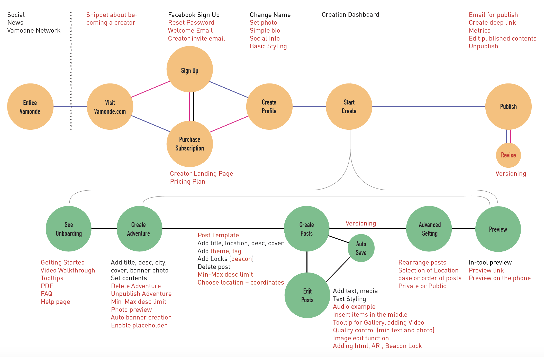
How Can We Lead Users through Our Content?
Vamonde has a strict yet complex structure for its content. This brings a lot of challenge to the experience design.
ADVENTURE =
A collection of a series experience with a consistent theme
POST =
A piece of experience, posts under a consistent theme forms an adventure
CONTENT =
Detailed experience under each post, illustrated with text, pics and
other
forms of
media

User Flow Design
One of the limits for this task is that the new tool must comply with the current content structure of Vamonde offering which has a complex structure. Two types of user flow got into final consideration.
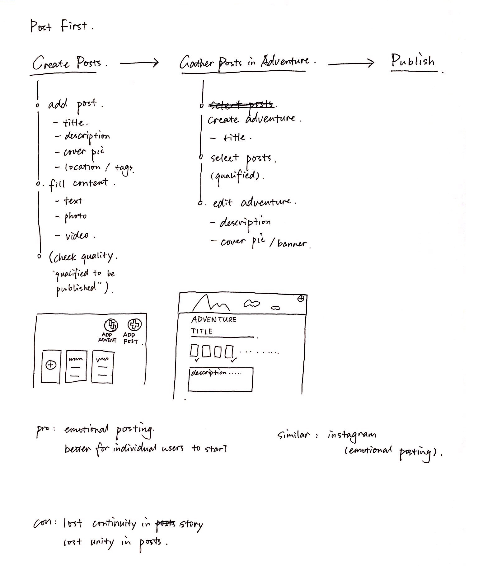
A. SPONTANIOUS - CONTENT FIRST
One of the limits for this task is the new tool must comply with the current content structure of Vamonde offering. Two types of user flow got into final consideration.
Similar to the Song Writing Experience. You create pieces of music first and then collect them into an album.

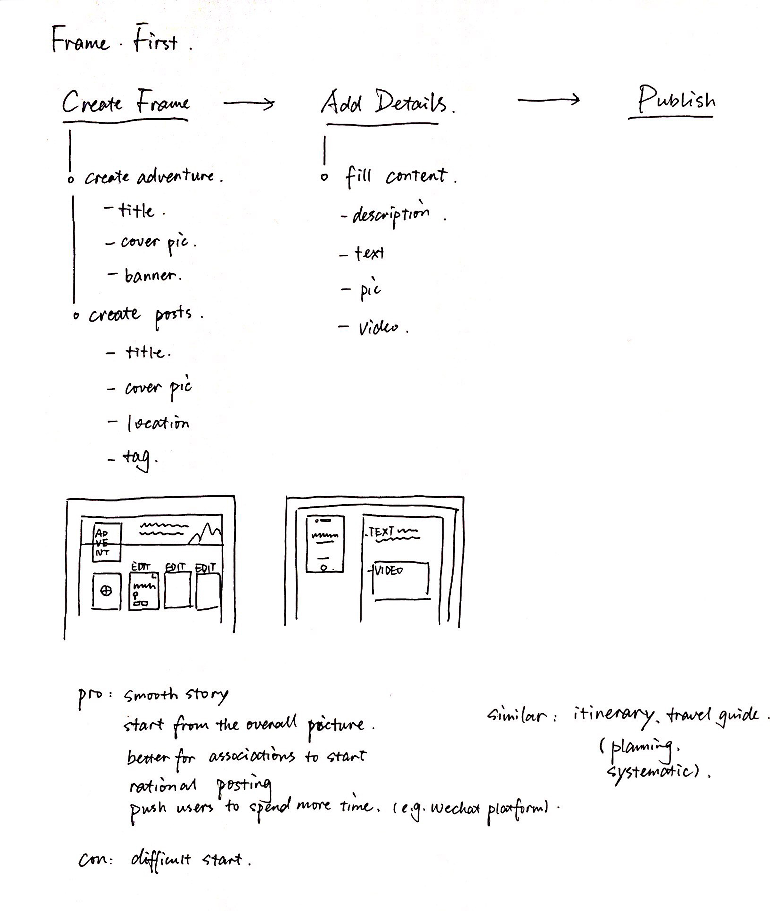
B. SYSTEMATIC - STRUCTURE FIRST
One of the limits for this task is the new tool must comply with the current content structure of Vamonde offering. Two types of user flow got into final consideration.
Similar to the Book Writing Experience. You figure out every chapter first and then fills the content.

Decision on User Flow
A COMBINES B
Considering our offerings are highly-curated experiences which are mostly provided by our
business partners in tourism industry, option B would be a better fit to help them generate
content with good quality;
While we want the content to be appealing and touching,
definitely not like something you read from Wikipedia. We would like users to catch more
sparks
with Option A.

We are looking for a solution between A and B -
we encourage users to create from
top to bottom with hierarchy, but also be able to shift around when they feel like
to.
CHALLENGE ONE -
HOW TO HELP USERS FOLLOW THE HIERACHY
—
First Thought - Narrate the content
PROS
Breakdown long process with complex content;
Simple information on each screen;
Lower the burden of users;
Easier for users to follow the flow;
CONS
Not efficient for expert users;
Streamline process, not able for users to jump around;
Lack the sense of overall picture as a complete story;
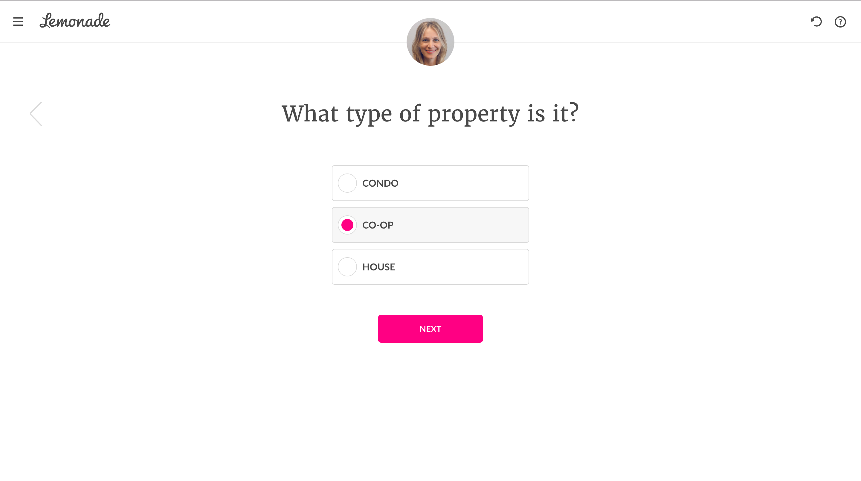
Ι Reference - Lemonade
Insurance
Second Iteration - Manage the content
PROS
Strictly structured;
Detailed navigartional system;
An overall picture with a sense of control;
CONS
Small operating space;
A mixture of actionable and preview area;
The first and second section look similar and confuse users;
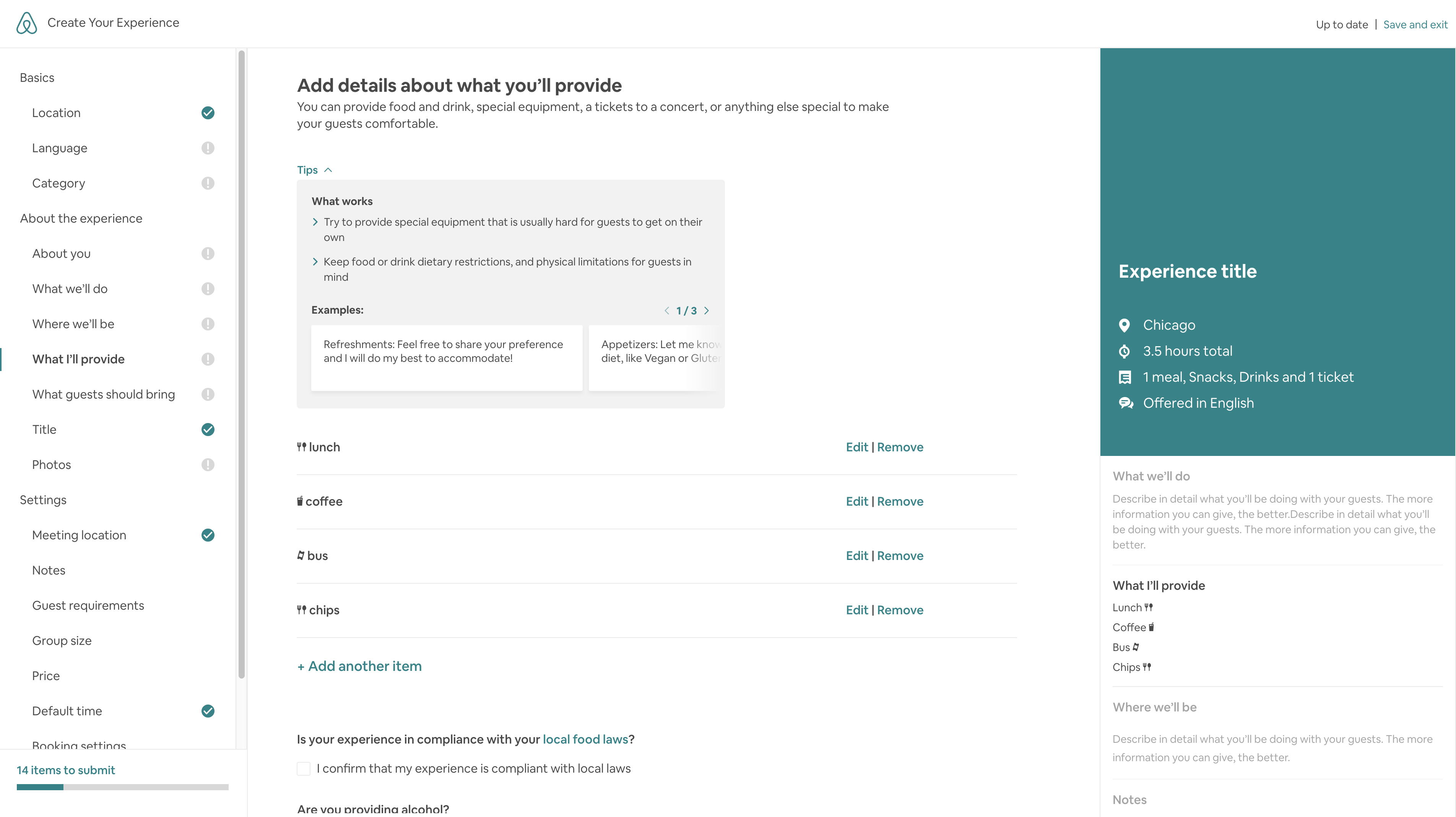
Ι Reference - Airbnb Experience
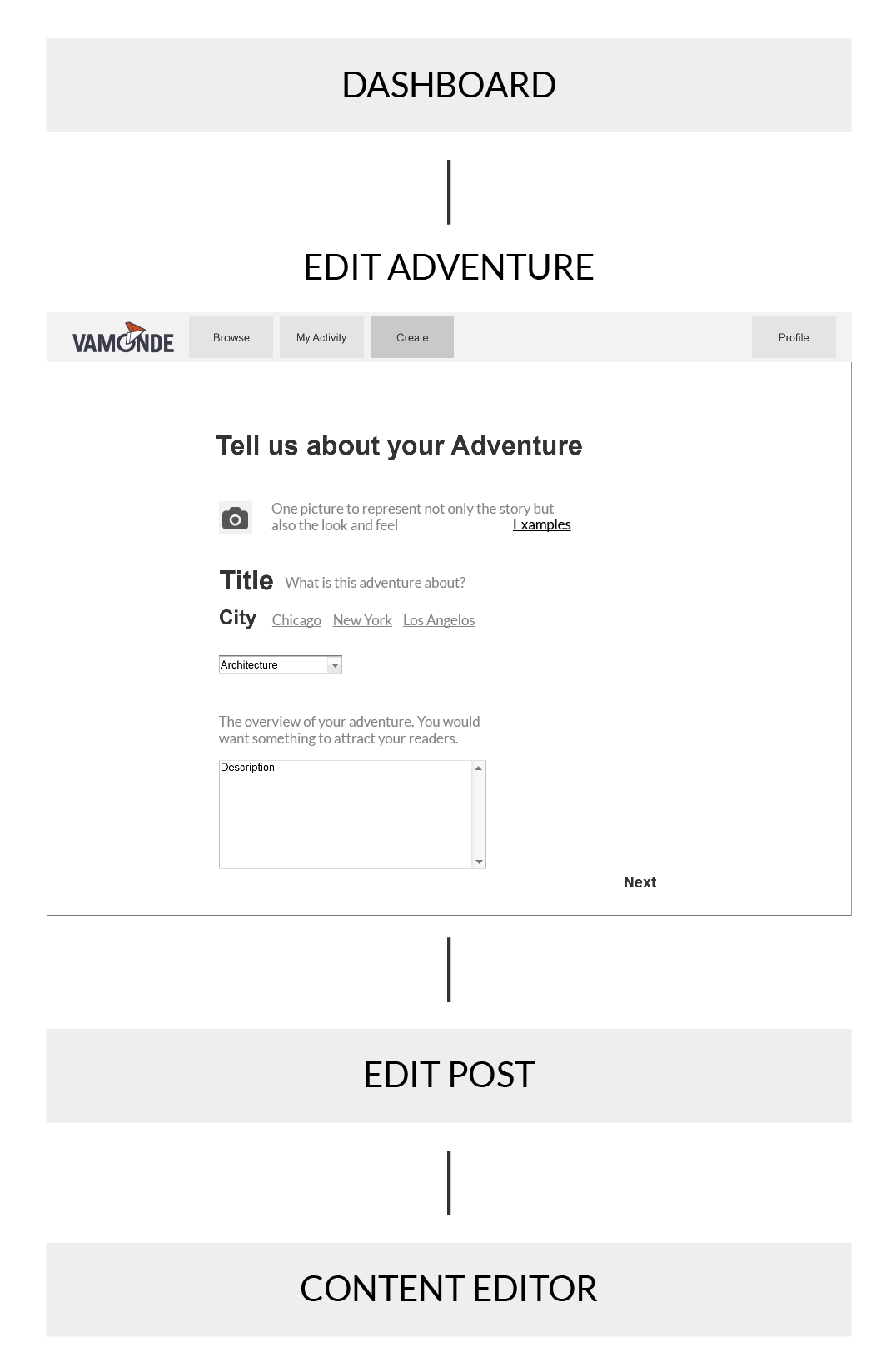
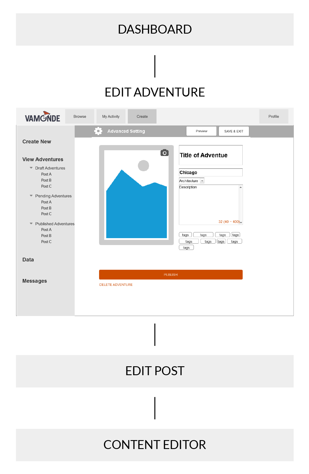
Final Iteration - Access to Post List
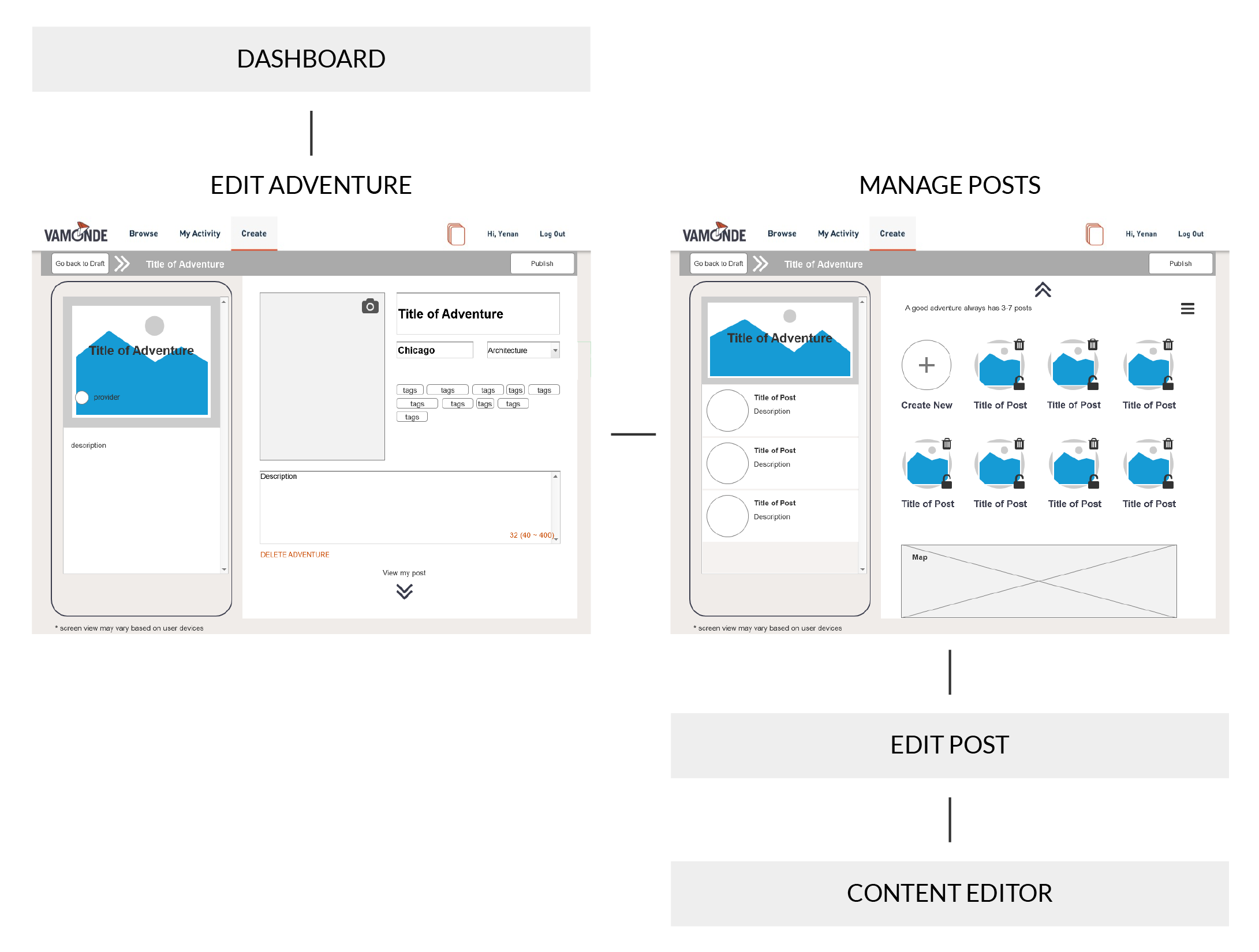
UPDATES
- Segerate the Post List from the details of the adventure. Simplify the hierarchy and make it easier for users to operate on;
- Separate Preview Area and Operational Area, with less chances to confuse users
- Use Breadcrumb Navigation, enable users to navigate around
CHALLENGE TWO -
HOW TO HELP USERS NAVIGATE THEMSELVES
—
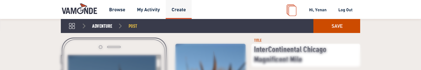
Navigation - First Iteration
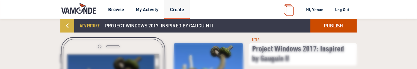
Ι Navigation Bar: Dashboard >
Adventure
Ι Navigation Bar: Dashboard >
Adventure > Post
Ι Navigation Bar: Dashboard >
Adventure > Post > Content
FEEDBACK
Heavy on visual. Lost focus;
Lots of text. Hard to ready;
Misunderstand the icon;
Decision on Icon
Is there anything better than a back arrow? Which icon can better introduce users going back to the home page?
Style and Layout
The first rule is to comply with the existing visual style and branding. To design a navigation system that is cognitively accessible while with less burden on visual.
Ι Simplified version
Ι Transparent background
Ι Thick and short navigation
bar covering operational area
Ι Thin and long navigation bar
being covered by preview
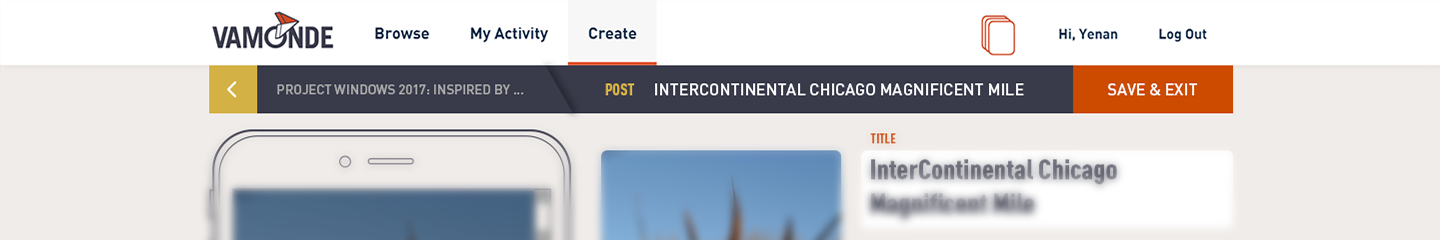
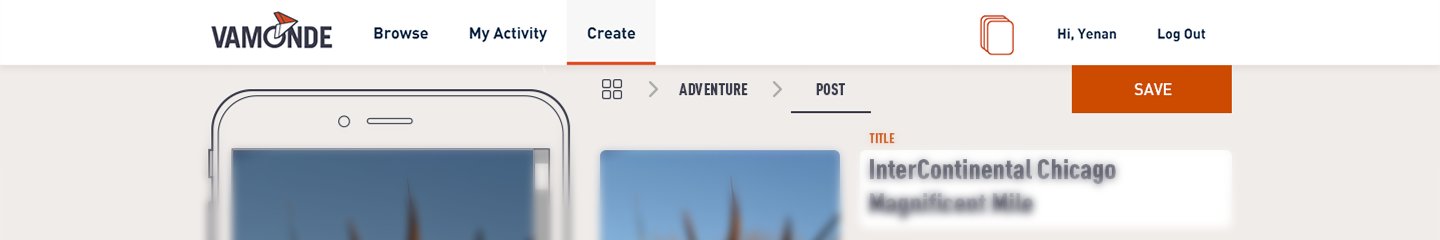
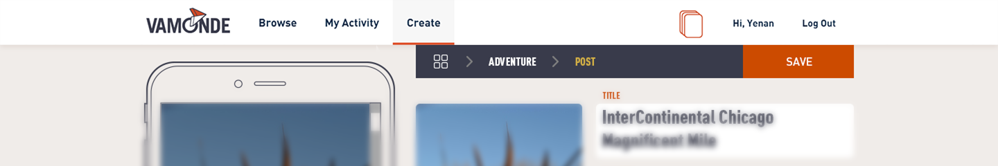
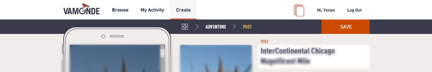
Navigation - Final Iteration
Ι Navigation Bar: Dashboard >
Adventure

Ι Navigation Bar: Dashboard >
Adventure > Post
Ι Navigation Bar: Dashboard >
Adventure > Post > Content
UPDATES
Thin and long navigation bar to fit with the main navigation bar;
Colored background in sub content page for users to focus on the structure;
Transparent background in main content page for users to focus on creation.
CHALLENGE THREE -
HOW TO HELP USERS BETTER UNDERSTAND THE CONTENT
—
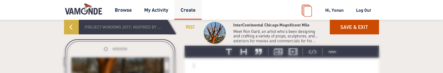
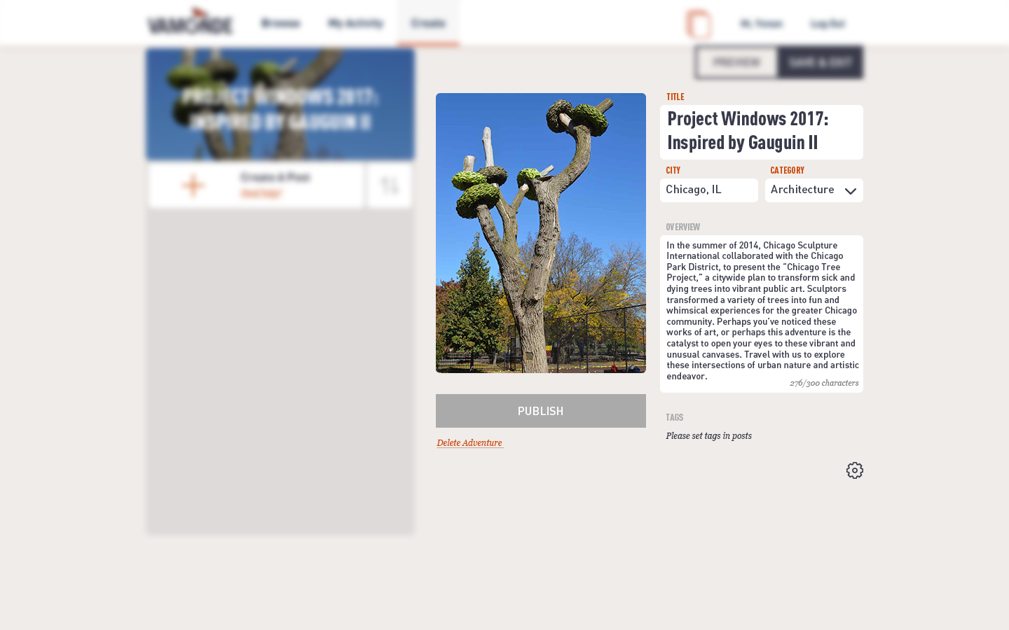
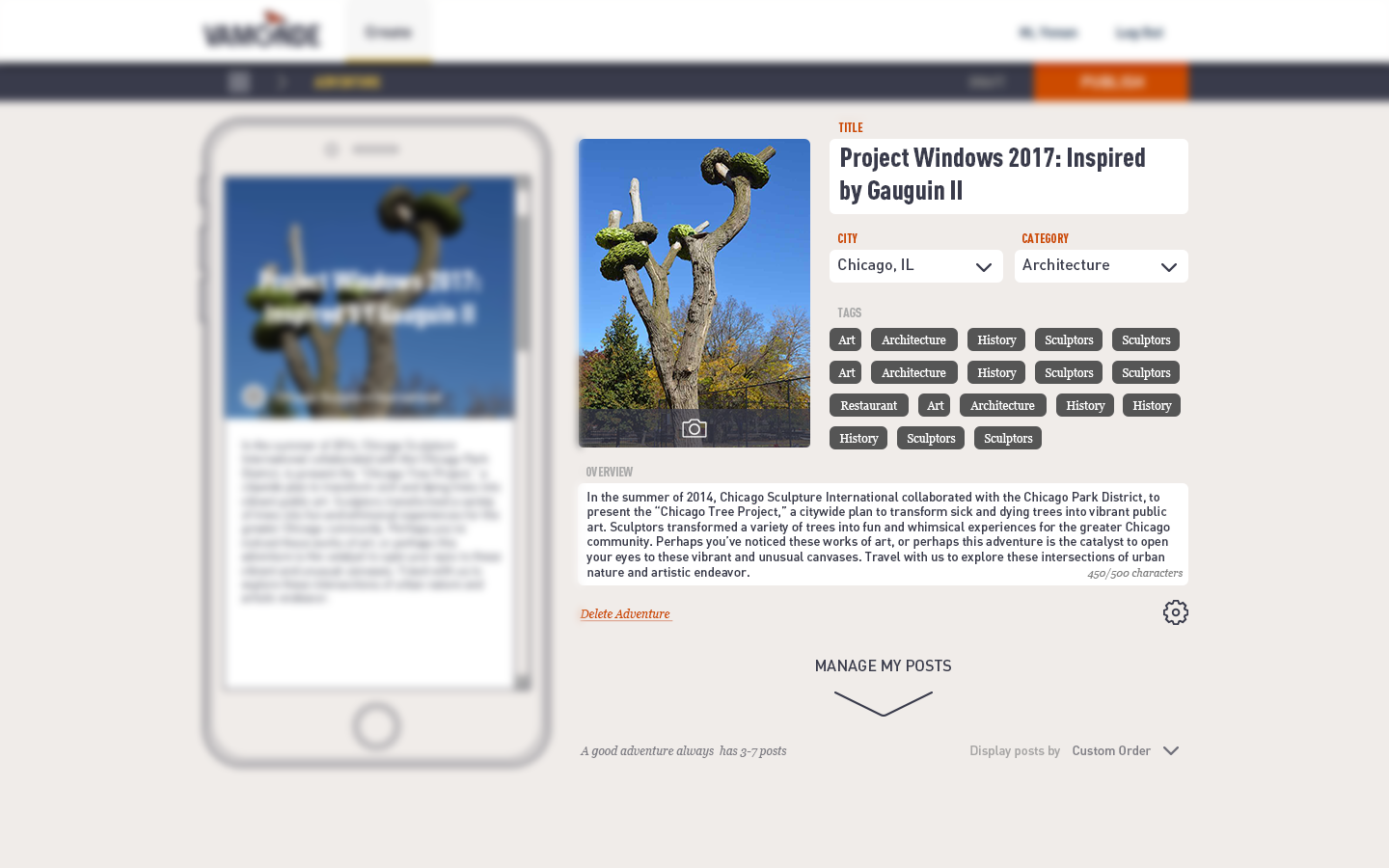
Content Layout - Two Iterations
There are varied kinds of information in one screen. Cover picture, title, location, tag, overview. Design a layout for all those content that can guide users to fill out varied information correctly.
TEAM DISLIKE
The image takes too much space;
Inadequate space for the title;
The textbox looks heavy;
TEAM LIKE
The image is in a decent size;
Enough space for all textboxes;
USER FEEDBACK
The long textbox on the bottom makes users feel like they have an essay to write.
"It's intimidating."
Content Layout - Final Iteration
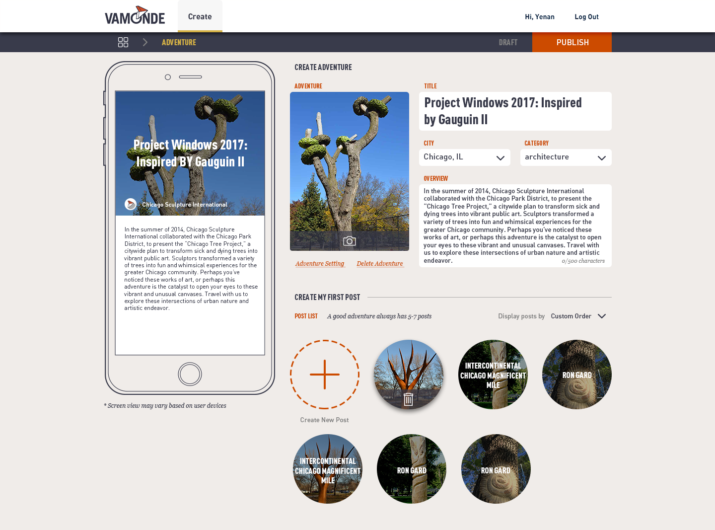
UPDATES
Images and textboxes in decent size and shape.
Oncoming content attached to the bottom of the screen. So users would know what to expect.
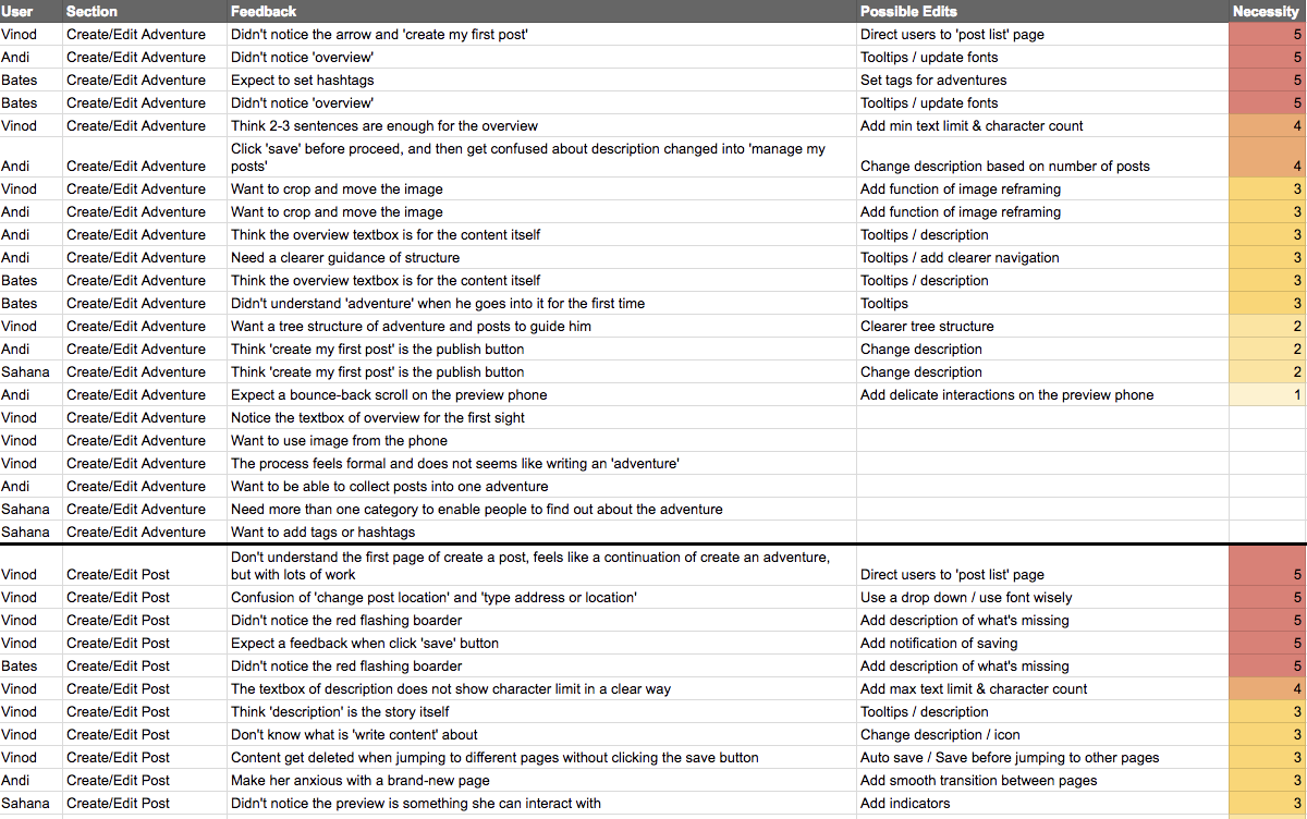
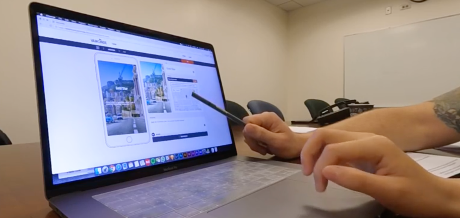
USABILITY TESTING
—
Usability testing is a great tool to validate my design with end users. Through User Testing, we are able to learn about the user journey of how people create content ( when users are first exposed to the tool ), and also to test out the effectiveness, efficiency and satisfaction of the new tool ( when users get acquaint with the tool)
Onboarding of Usability Testing
One challenge for this usability testing is that the interviewees should have a basic understanding of Vamonde content - this tool is mostly designed for expert users. While interviewees we could reach out to are non-users with writing experience. There is something to be designed for onboarding before we jump into common usability testing process.
I gave my interviewees sometime to explore and get familiar with our Vamonde mobile app, the B2C product which my creation tool is supporting for. I use a metaphor to introduce the concept of adventure, post, and content, which are similar to the album, song, and the rhythm. And I told them later they would write an adventure on their own.
Testing Proposal
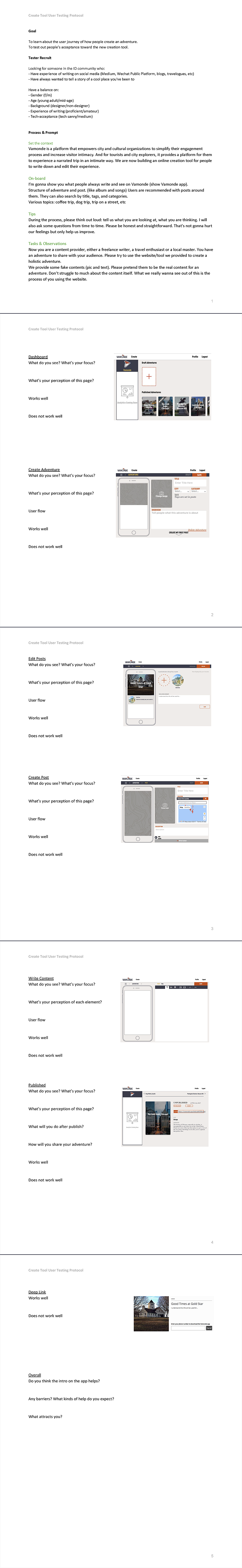
Feedback Analysis